Marketing
Metro Kitchen
Bengali urban poster campaign for a student-focused food cart startup.
- Client
- Metro Kitchen
- Industry
- Food & Restaurant
- Year
- 2024
- Services
- Art Direction, Poster Design, Campaign Design, Visual Communication
The project
Campaign & Poster Design
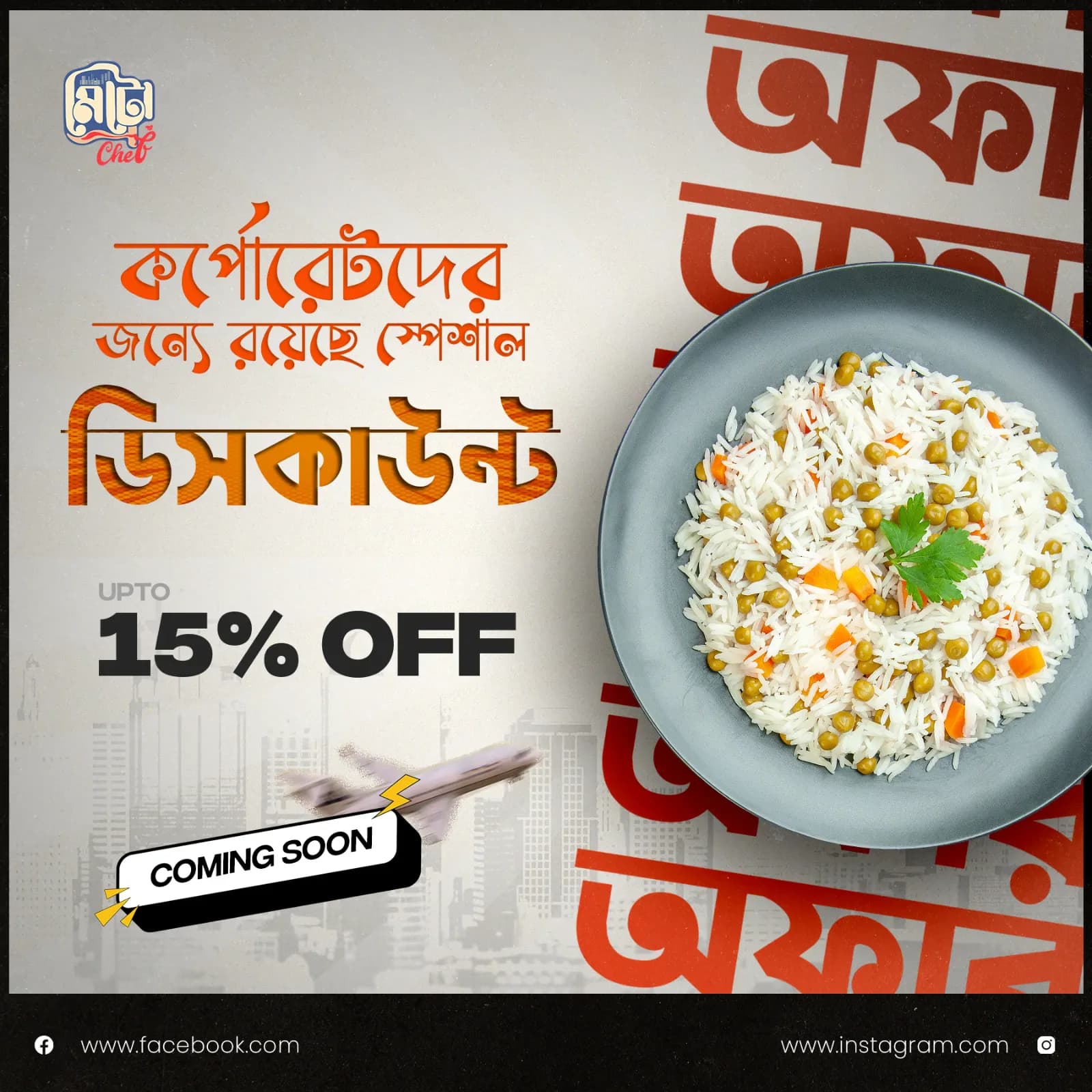
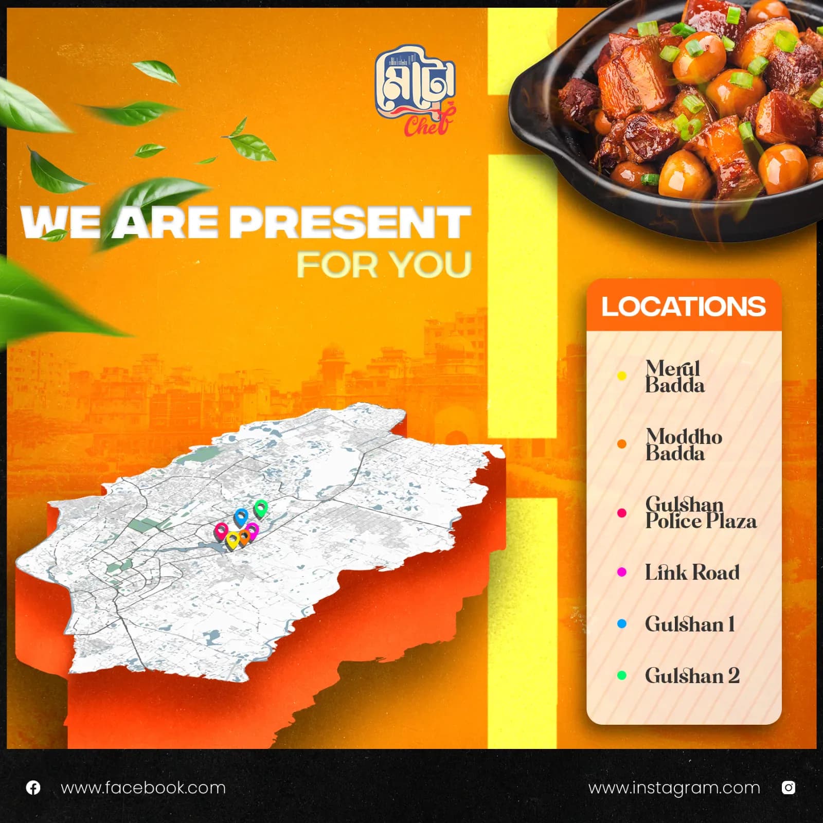
Metro Kitchen is a food cart startup created for a fast-moving urban audience. We developed a poster campaign that could promote offers and locations while building a recognizable visual identity around the brand.
The brief
A restaurant brand with a distinctly Bengali urban voice
Metro Kitchen wanted its communication to feel local, energetic and contemporary without losing the appetite appeal and clarity expected from a food brand. The primary audience was university students and younger customers, so the visual language needed to feel approachable rather than formal.
The challenge
Create promotional material that could immediately communicate offers and locations, feel rooted in Bengali city culture, and still work as part of a consistent restaurant brand.
Discovery & strategy
Building the campaign around local familiarity
The direction started with the audience rather than the poster format. We focused on the visual cues young urban customers already recognize: expressive Bangla typography, strong promotional messaging, warm street-inspired tones and bold food imagery.
Communication first
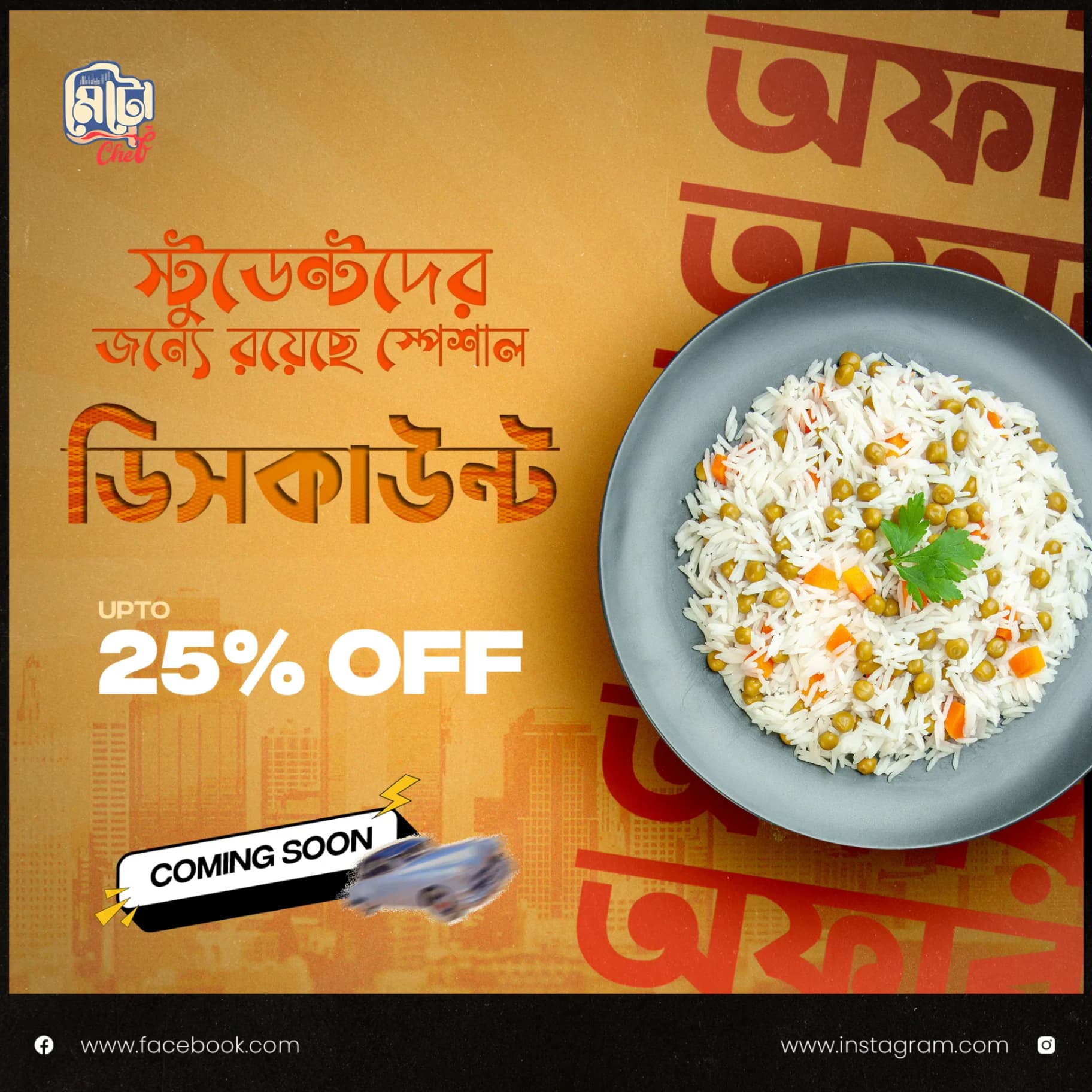
Each poster was structured so the key message could be understood quickly. Offer amount, audience and food imagery were given clear visual priority before supporting details.
A repeatable system
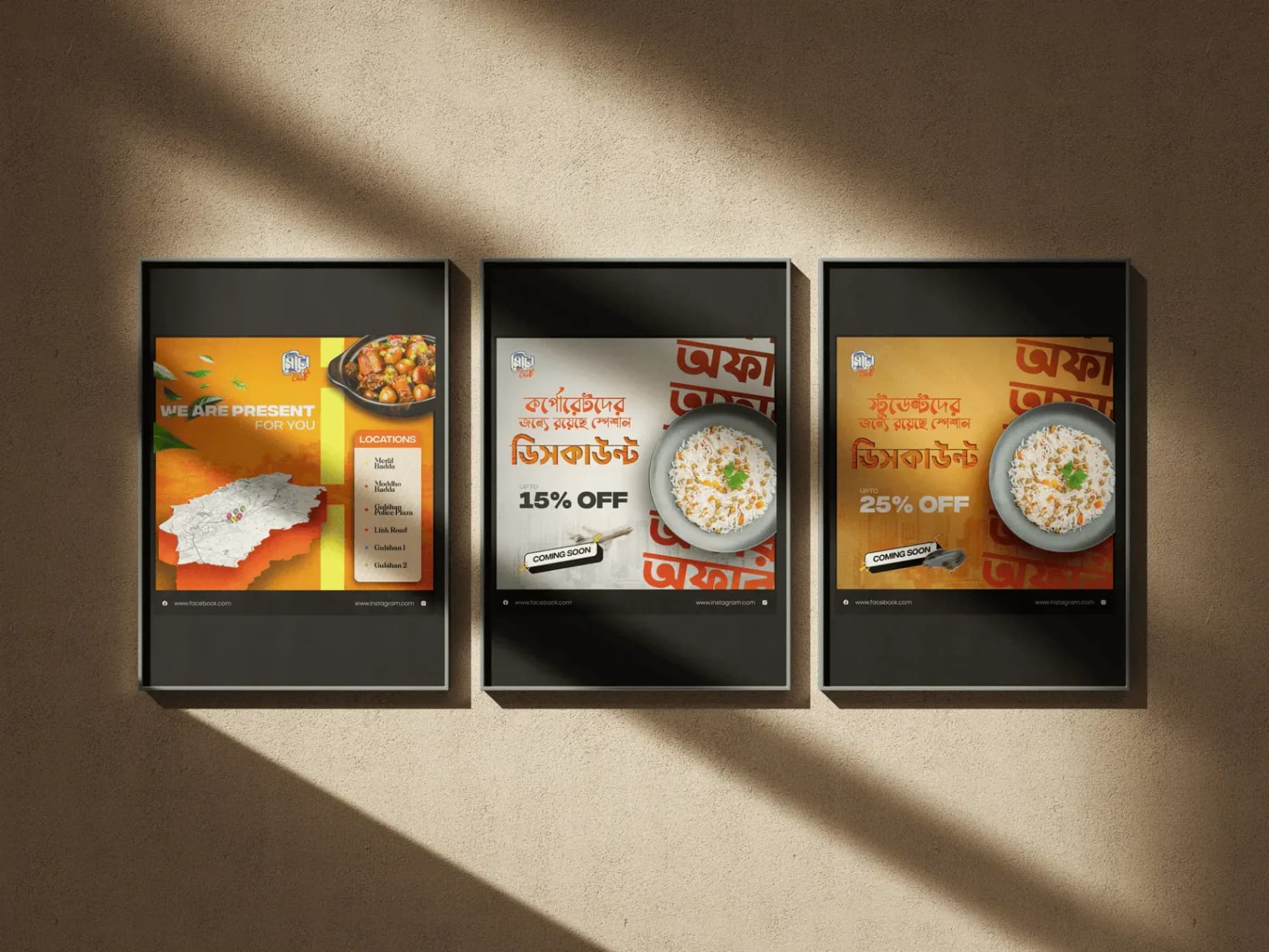
Instead of treating every poster as a separate artwork, we established recurring typography, image treatment, graphic elements and composition rules so future campaigns could remain recognizably Metro Kitchen.
Design approach
Bengali urban energy, balanced with restaurant clarity
The visual system combines expressive Bengali type with layered compositions, warm orange and red tones, urban textures and prominent food photography. The result feels lively and culturally familiar while keeping the promotional message easy to scan.
Typography as a visual element
Bangla typography was treated as part of the composition, not simply as copy. Oversized letterforms and layered text created rhythm, movement and a stronger local identity.
Food stays at the center
Food imagery remains one of the strongest elements in every layout, ensuring that the campaign still reads immediately as restaurant communication despite the expressive graphic treatment.
Campaign variation without losing consistency
Different color treatments and layouts distinguish individual offers, while shared type, framing, image treatment and branding keep the collection connected.
Campaign execution
A system built for offers, locations and future promotions
The campaign was extended across multiple communication needs, including student-focused offers, corporate offers and location awareness. Each execution follows the same core visual language while adapting its hierarchy to the message.
Results & impact
A more recognizable voice for Metro Kitchen
The final campaign gives Metro Kitchen a visual direction that feels urban, Bengali, youthful and food-focused. More importantly, it creates a foundation the brand can continue using across future promotions rather than relying on disconnected one-off designs.
Next project
View all workshave a project in mind?
Tell us what needs to move. We’ll bring strategy, design, production and digital craft into one clear process.


Our team:
- “We are always ready to help.“